Showing posts with label Hochanda. Show all posts

Monday, 8 June 2020

Four Seasons Embroidered Button Clock created for Gina B Silkworks

Today I am sharing my project created with the new MDF Button Display Clock Set from Gina B Silkworks. My design was inspired by Gina’s lovely 4 Seasons Mirror Button Brooches Kit. I used the same freestyle ‘lace’ embroidery technique to create the embroidered trees into the central section of the clock, adding depth to a painted scenic background. 
I created 8 more thread wrapped and embroidered buttons to fit the Spring, Summer, Autumn and Winter theme for display around the perimeter. Instructions were from various button kits available from Gina along with my own thread stash and colours. Kits included the Victorian Button Journal Kit, Snowflake Button Pattern Pack and the Woven Button Motifs Design Booklet.

I created 8 more thread wrapped and embroidered buttons to fit the Spring, Summer, Autumn and Winter theme for display around the perimeter. Instructions were from various button kits available from Gina along with my own thread stash and colours. Kits included the Victorian Button Journal Kit, Snowflake Button Pattern Pack and the Woven Button Motifs Design Booklet.

Materials
Other optional accessories:
Circle Button Gauges (helps with even placement of thread wraps and embroidery on buttons)
Button Makers Third hand Tool & Tin (contains beeswax and a third hand for holding part wrapped buttons when changing colours and finishing etc.)

How it was done:
Preparation of the buttons for display:
I first created the 4 Seasons Mirror Buttons as given in Gina’s kit instructions. The kit contains enough materials to create 8 buttons; 2 of each of the 4 seasons. It also contains all the components, threads and needles required.
With one set of buttons I created 4 pendants (they are intended for making a necklace or brooch).
My second set of buttons were used for my clock display to place on each of the 4 main quadrants.
I next worked 8 more buttons for the display, 2 more for each seasonal clock quadrant. Instructions were followed from Gina’s Original Snowflake Pattern Designs, Victorian Button Journal Kit or from her Woven Button Motif Design Booklet. You could include any buttons that you like by creating in colours and designs to suit the seasons.
Four buttons were made on fabric covered slightly domed wooden moulds from my stash. You can use the 25mm flat button moulds included in the clock kit instead. Just cut some felt circles to place on the button front before covering to give a bit of padding and shape.

To cover my buttons I cut fabric circles approx. 45mm in diameter (i.e. enough to cover front and wrap around back of button). I then worked a row of running stitch to gather up and pull in the fabric over the button back.

I then worked designs from Gina’s Original Snowflake Buttons Designs or from her Victorian Button Journal Kit.

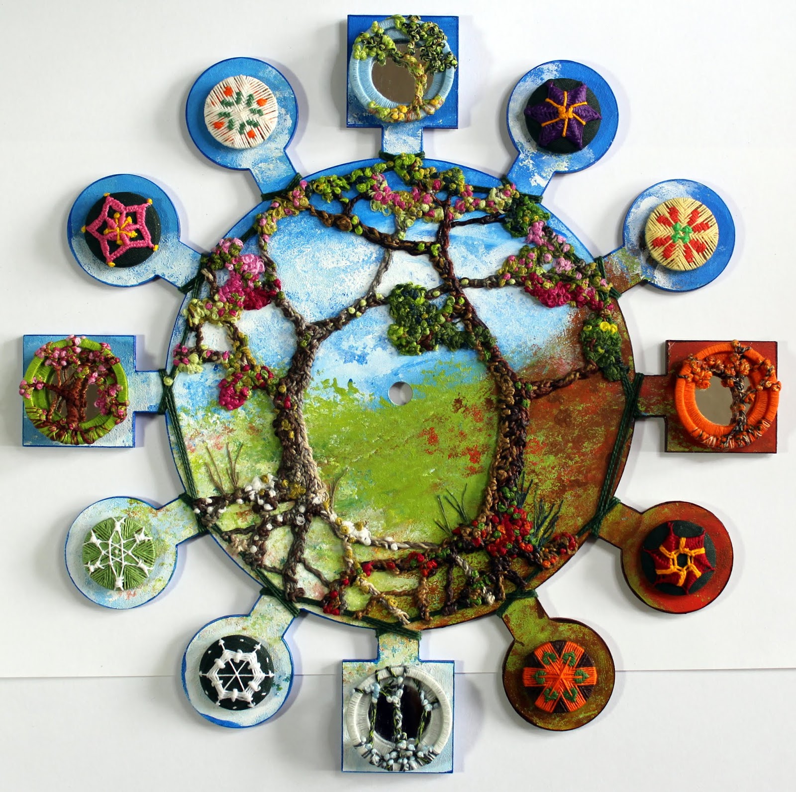
Top Left – Spring Button: Victorian Bordered Star pattern in pink perle cotton. I embellished with extra stitching and French knots in yellow perle cotton.
Top Right – Winter Button: Snowflake pattern C in white perle cotton, working on a fabric base rather than a thread wrapped button base. I also added a little extra stitching around the perimeter.
Bottom Left – Summer Button: Victorian Flower pattern in purple and yellow perle cotton. I added some extra French knots to the centre.
Bottom Right – Autumn Button: Victorian Lace Circle pattern in red and yellow perle cotton.
The next 4 buttons were worked on 25mm flat button moulds as included with the clock kit. I worked designs from Gina’s Original Snowflake Buttons Designs or from her Woven Button Motif Design Booklet.

Top Left – Spring Button: Woven Button Flower Sprig design in off white, green and orange perle cotton.
Top Right – Autumn Button: Woven Button Leaf Style 3 design in brown & orange perle cotton for the base wrap and green for leaves.
Bottom Left – Summer Button: Woven Button Lavender Flower design in pale yellow perle cotton for base and green & orange for woven flower.
Bottom Right – Winter Button: I worked a 6 point wrap with perle No.8 pale green thread and worked the Snowflake Pattern B with white perle No.8 thread.


Decorating the clock:

I first covered my clock base with white Gesso. This step is not essential but it provides a good base for painting. A clean bright base will show acrylic colours to their best. Particularly if using semi transparent acrylic colours (different paints vary in opacity) where the MDF base colour would affect the overall colour of subsequent painted layers). It also saves acrylic paint as it stops paint absorbing into the porous MDF.
The clock was then painted with acrylics to create a background scene on which to work the embroidery.
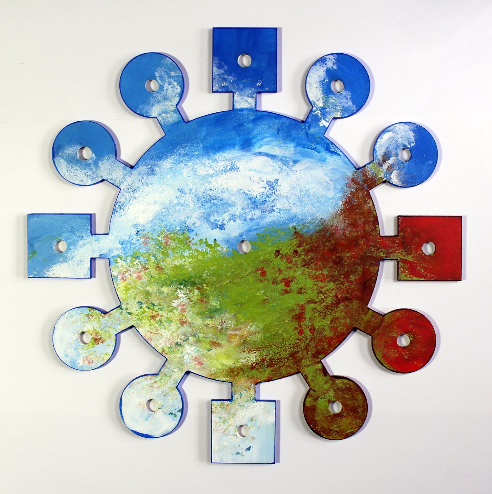
In keeping with the 4 seasons theme I painted a background sky with clouds on the top half of the clock (which will be my Spring and Summer clock quadrants). In the lower right foreground I introduced greens, browns and red to represent the Autumn colours. In the lower left I used pale and white colours for my Winter quadrant.
I introduced texture by ‘stamping’ paint onto the surface using the sea sponge. This was worked really quickly and randomly, just to give the impression of foliage. It is important to rinse paint out of the sponge quickly when done (acrylics dry very quickly and will ruin the sponge if left to dry).
Once the paints were dry I used alcohol markers around the clock edges to neaten and to frame.
I laid out the buttons into their positions to check how they looked (not stuck down yet).
Dark green perle 8 cotton was used to wrap around the thread spokes. This was to create an outer frame on which to anchor the tree embroidery.
I wrapped around the edge of the clock 3 times to create a neat frame. I used a little Transparent Powertex on the back of the clock (behind the spokes) to anchor and glue the threads down securely and prevent them working loose (leaving the front threads free).
Next the main tree trunks, branches and roots were created using similar techniques as used in Gina’s 4 Seasons Mirror Buttons – only on a much larger scale. I didn’t take a lot of step by step pictures here (sorry) but will try and talk through how I went about it with tips to help you create similar.
While working this embroidery it is really important not to add too much thickness or depth which would impede movement or catch on the clock hands. I tried on the hands to work out the clearance needed, paying particular attention to the short hand which fits closest to the clock base (subsequent hands fit slightly further outward). The clock hands are fairly soft metal so can be very gently eased upward slightly if needed (if you do this you would need to adjust the angle of all the hands so that they don’t catch on each other). The tightest depth area is in the very centre of the clock so I kept this area free of embroidery.

Should you have a bit of a disaster don’t fret. After all that hard work, all is not lost. Clock fittings are easily available from various online sources with different spindle depths, so a fitting with a longer spindle could be substituted if needed.

To work the trunks, branches and roots I used a mix of perle 5 and 8 threads in browns, greys, and creams. Stranded cotton threads could also be used, splitting them down and working with 3 or 4 individual strands together.

To start I tied thread onto the outer frame and worked back and forth laying threads loosely across the clock, tying top and bottom to make the main trunk foundation. Next I started weaving and wrapping threads, working up and down the trunk and taking branches and roots off to the edge. As the extra branches were worked the embroidery was pulled more tightly to hold it flatter. This tightened up the main trunks. Weaving and wrapping also tightened things up.

I first worked the right hand tree using warmer, deeper and richer browns and creams. This half represents the Summer and Autumn quadrants. I then worked the left hand tree in cooler colours to represent Spring and Winter sections. Where the branches intersected I was careful not to increase the embroidery depth, working branches that intersect in sections (rather than creating a double thickness where branches crossed).
Here is a closer view showing the colour contrasts and stitching detail. I tried to create the effect of light coming through the centre by using lighter colours on the inner tree trunks. I also added extra texture using occasional French knots.
I again laid out the buttons to see how they looked (not stuck down yet). Woohooo – I so enjoyed making this. Next for the foliage.
Before gluing down the buttons I worked the foliage and blossoms. I used stranded cottons (working with 3 individual strands) in a variety of greens and lemon for the foliage, worked in random French knots. Again I used deeper, warmer colours on the right hand tree. Variegated threads are nice to use as you automatically get a mix of colours while working.
I then added pink blossoms to the left hand tree.
Finally I worked more French knots along the root sections; warm Autumnal colours on the right and Winter colours on the left. Little grassy tufts were worked by tying on wisps of thread.
Next I stamped the sentiment using Stazon Ink. I thought that the ‘time flies’ sentiment suited the time going through 4 seasons theme.

Before gluing down the buttons I treated them, and the embroidery, with Transparent Powertex in order to seal everything. Powertex is primarily a fabric stiffening medium. It also acts as a glue so helps to hold down all the embroidery onto the clock face so it keeps it all flat and less likely to lift and catch on the clock hands. A damp cloth can also be used for cleaning as Powertex provides a waterproof seal. It also does not discolour with time (whereas some glues certainly would).

To get a nice finish with Transparent Powertex you need to take care not to over flood it. Too much could leave a ‘gloopy’ looking finish. I use a paint brush to work the medium well into the fibres, working small sections at a time. I then quickly remove any excess from the surface quickly (before it starts drying and going tacky) by dabbing with a clean cotton rag (e.g. old tea towel). I find that this method works really well and makes the finish hardly noticeable.

Finally I glued down all my buttons using clear drying thick acrylic gel medium (other 3D glue gels would work too). If you would rather be able to change your buttons around then use Gina’s recommended method and make a button shank to hold your buttons on with pins.

Delighted with my finished clock and I had so much fun creating it. It was definitely a labour of love, not a quick make, but well worth it.

Hoping that you are all keeping well during this difficult time. Let’s hope that time does fly for us all and that we are back to some sort of ‘normal’ living very soon. Take care.

Happy Crafting, Anne x.


Wednesday, 4 April 2018

Tranquil Meditation and a Happy Place


Good morning. Today I am sharing some of my recent show samples using Tranquility, Wisteria Lane and Artistic Affirmations stamp sets from Chocolate Baroque.

I created 3 different scene cards, one using vibrant happy colours, one in blue & white monochrome and my third was an attempt at Parchment. I hope that you like them.


Happy Place
I love colour so I created this ‘Happy Place’ using a bright cheery colourway.
 
Materials:
  • Tranquility, Wisteria Lane and Artistic Affirmations stamp sets
  • 8 X 8 inch card blank, white stamping card, scrap copy paper
  • Inkpads: Versamark, Versafine (Vintage Sepia), Distress Ink (Wild Honey, Dusty Concord)
  • Pigment powders (Lindy’s Stamp Gang – Urban Amethyst, Poppin Pink, Luminous Lemon)
  • Embossing powder (purple and pink mix)
  • Watercolour, sparkle and glitter pens (Spectrum Noir and Sakura – yellow, green, purple, pink, orange, brown, clear sparkle) and coloured pencils
  • Fine tipped marker (waterproof brown, opaque white) and alcohol marker (dark purple)
  • Zig 2 way glue
  • Cosmic Shimmer PVA pearls (Vintage Pink), Stickles Glitter Glue (Star Dust) and Glossy Accents
How it was done:
  1. The lanterns were stamped onto copy paper and cut out to create masks. I dotted a little zig glue on the back and left to dry. This glue then gives a temporary tac to hold the masks in place while stamping.
  2. The scene was stamped with Versafine, stamping the foreground images first then covering with masks while stamping the images set behind. The scene was extended by drawing with the fine tipped pen (i.e. water swirls).
  3. The foliage across the top was stamped with Versamark and pigment powders were applied with a soft brush. Further foliage was stamped with Wild Honey Distress Ink. The sentiment was stamped with Versamark and heat embossed with powder.
  4. The image was coloured with watercolour pens, dissolved pigments, sparkle overlay and glitter pens. Highlights were added with white pen and additional shading added with pencils.
  5. The image was edged with alcohol marker and by blending with Dusty Concord Distress Ink.
  6. Extra sparkle was added with glitter glue and Glossy Accents. PVA pearls were applied to the border.
 
Tranquility

I have been trying to have a go at Parchment craft as I love the delicate result. I thought that it would make a lovely tranquil version. No picot cutting as I am hopeless, so I cheated with a die. I tried to hide the glue but still ended up with a blob of showing through the parchment – eek! I was fairly pleased with the results but have a lot to learn and more practice needed yet.

Materials:
  • Tranquility stamp set
  • 6 X 6 inch scalloped card blank, parchment, gold satin board
  • 6 X 6 inch decorative stencil
  • Pergamano tools (embossing mat, embossing tools, mapping pen, Sticky Ink and Perga Glue)
  • Inkpads: StazOn (Opaque White), Distress Ink (Tattered Rose)
  • Scalloped circle dies (Pin Dot Scalloped Circle - Tattered Lace)
  • PVA pearls (tangerine), extra fine glitter and sequins
  • Used tumble dryer sheet
How it was done:
  1. The gold card and parchment were cut out using dies. The background was created using Distress Ink through the stencil (using a blending brush).
  2. The image was stamped onto the front of the parchment using white StazOn. I then embossed the outlines on the back of the parchment using a fine embossing tool, tracing the stamped image. To help aid the embossing tool to glide on the parchment I rubbed over the surface using the tumble drier sheet first.
  3. Larger embossing tools were then used to add shading. Although it is generally called ‘shading’ it is actually ‘highlighting’ as embossing stretches the parchment and makes it whiter. You need to work gently and slowly, leaving the parchment to rest between layers of further whitening. I did tear her cloak (eeeeek) but managed to disguise it with a little Perga Glue which was later covered with glitter.
  4. Sparkly highlights were then added to the front using a mapping pen (dip pen), sticky ink and extra fine glitter.
 
Meditation


I love creating monochromatic blue & white cards. Perfect for a tranquil meditation.
 
Materials:
  • Tranquility and Wisteria Lane stamp sets
  • 15cm square card blank, blue card for die cut panel, white stamping card
  • Versafine Inkpad (Majestic Blue)
  • Water based sparkle pens (Spectrum Noir - blue and clear)
  • Alcohol marker (dark blue)
  • PVA peals
  • Decorative square and arched panel dies (Tonic)
 
How it was done:
  1. The images were stamped with Versafine ink and were coloured with sparkle pens and a damp brush to create shading. Decorative stamped elements were positioned to frame the central image.
  2. The panels were cut using dies and edged with blue marker to frame. 3D foam was used to mount the central image and give it more depth.
  3. Finished with PVA pearls.

Monday, 15 January 2018

Birthdays are Good for You Quick and Easy Card created for Chocolate Baroque

Good morning. This is one of my quick and easy samples created for Chocolate Baroque. You can make it in around 15 minutes.


Materials:
How to make it:
  1. Stamp the background card randomly with black ink. Note: I used StazOn as my card blank was shiny (if you are using mat card then Versafine will be ok).
  2. Trim the stamping card to fit the front leaving a border and edge with black pen. Draw a circle lightly in pencil and divide into quarters. Stamp using 3 small stamps on the block at the same time and Versafine, turning the card between stamping and stamping into each corner to create a wreath design. Tip: Lay your stamps onto the card placing them around your drawn circle and then pick them up onto your acrylic block. A gridded acrylic block will help you to line up while repeat stamping. Note: This can also be done with a stamping gear if you have one, or using a stamp platform, turning the card 90 degrees between each stamping. Do a quick practice on copy paper to get the placement. You need to leave enough space for the sentiment in the middle. This sounds complicate but it really is easy – honest.
  3. Stamp the sentiment with Versafine and colour the images with sparkle pens. Glue to the card front.

Quick and Easy Birthday Card created for Chocolate Baroque


Tuesday, 21 November 2017

Because I Care Poppy Card created for Chocolate Baroque

Good morning. This was another of my recent show samples for Hochanda using the lovely poppy themed stamps from Chocolate Baroque. I used Brushos on this one to create a loose watercolour background.


Materials:
How it was made:
  1. The border panel was cut from hammered card and glued to the card front.
  2. The pink card was trimmed to fit and the sentiment stamped with Versamark and embossed with white powder. Faux stitching and little dots in the background were added with white pen.
  3. The poppies were stamped onto watercolour card, ‘inking’ the stamp with the pink and green watercolour pens. To get the lovely watercolour effect the card was spritzed with water to get the stamping colours to bleed slightly. Brusho crystals were then dropped onto the background.
  4. After drying the image was overstamped using Versafine (Vintage Sepia) to bring back some definition. I used a black pen to enhance some of the stamped outlines. More colour was added using watercolour pens and a damp brush. The sentiment was stamped with black ink.
  5. The image was trimmed and glue to the card front. Finished the card with a few PVA pearls and yes …. obligatory glitter glue. Just cannot help myself x.

Sunday, 19 November 2017

Sneak Peek of show samples created for Chocolate Baroque on Hochanda Tomorrow

Good morning. Here is a sneaky peek at some of my samples created for Chocolate Baroque. Lesley Wharton will be bringing some lovely stamp sets to Hochanda TV tomorrow (Freeview Channel 85 or watch live online from their website). I think that the shows are scheduled for 4pm and 7pm – check their schedule for confirmation xxx.


Sunday, 5 November 2017

Steampunk Travels Pop Up Box created for Chocolate Baroque

Good morning. I had so much fun creating a fantasy world with the Steampunk themed stamps recently featured on Hochanda. Today I am sharing one of my show samples. I just love this sentiment verse and the fun sentiments that come with these stamp sets.


Materials:
  • Steampunk Travel and Steampunkery stamp sets (also available as a multibuy)
  • Ready made white pop up card blank (approx. 7cm wide box with back panel approx. 16cm high), white stamping card, Kraft card
  • Inkpads: Dye based ink (brown) and Versamark
  • Ink sprays with mica (blue and gold)
  • Alcohol ink pens and coloured pencils (blue, orange, yellow)
  • Fine tipped pen (brown)
  • WOW heat embossing powders (mix of Verdigris and Gold)
  • Dies to cut steampunk cogs and shaped mat for verse
How it was made:
  1. The box was spritzed with inks to add colour and edged with brown ink.
  2. The images were stamped with brown ink and coloured with alcohol pens and some pencil shading.
  3. The verse was cut out with a die and edged with brown ink and faux stitching. The remaining sentiments were hand cut and edged with brown ink. The Steampunk images were cut out by hand.
  4. The cogs were cut from Kraft card, coated in Versamark and heat embossed with metallic powders.
  5. The images, cogs and sentiments were glued to the card layers to give depth. Thin card strips were glued behind some of the elements to add extra support where needed.

Tuesday, 26 September 2017

Harlequin Bouquet Canvas created for Chocolate Baroque


Good morning. Today I am sharing a small canvas created with the lovely floral collage stamp (Harlequin Bouquet) from Chocolate Baroque.

Materials:
How to make it:
  1. Stamp the image onto stamping card with Versafine and heat emboss with clear powder. Colour with water based pens.
  2. Randomly Spritz the canvas background and cover with UTEE while wet. Heat to melt. I wanted a bit of a random texture rather than smooth glass effect. If you want more texture pour a bit more powder onto the hot UTEE and melt. Ink the sentiment with StazOn and press into the molten UTEE. Leave until it sets before peeling away. I found the image was a little feint so darkened using an alcohol pen – drawing into the impressed lettering.
  3. Apply the glitter paste with a palette knife onto the background using the leaf stencil. Apply modelling paste through the butterfly stencil. Leave to dry.
  4. Lightly spritz the watercolour card with inks (you want it to be lighter than the canvas background so that it stands out). Cut out the frame with the decorative die and apply some ink to the edges with a sponge to define. Trim the main image to fit behind the frame and glue together. Mount onto the canvas with 3D foam.
  5. Finish with touches of glitter glue.

Friday, 15 September 2017

Quick and Easy Christmas card created for Chocolate Baroque


Good morning. This is a quick and easy Christmas card make – great when you have big batches of cards to get ready. I think that the sentiment might be better stamped directly onto the card front – quicker too.

Materials:
How to make it:
  1. Stamp the trees with Versafine and extend the base of the scene by drawing with the pen. Edge the card with black marker and a little Distress Ink. Glue to the card front.
  2. Stamp the sentiment with Versamark and emboss with the sparkly gold powder. Note: I combined 2 sentiments using the separate 'and' stamp to join them. Tip: Use a gridded acrylic block to help align the text level and straight.
  3. Trim and edge with black marker. Glue to the card front.
  4. Finish with a bow and with dots of 3D glaze pen.

Quick and easy floral cards created for Chocolate Baroque

Good morning. Here are a set of quick and easy 6 X 6 inch cards. Each can be made in under 15 minutes, so they are great for those speedy last minute makes.


I used patterned papers from Crafty Individuals (Travels in Italy or Springtime) for the background. Stamps include Harlequin Bouquet, Crackling Rose, Floribunda Net, Flora Musica and Loving Sentiments.

All were stamped with Versafine (Onyx Black) and heat embossed with WOW Embossing Powder (Clear Gloss). This makes colouring really quick and easy as the embossed lines resist the watercolour. I used watercolour pens, Distress Inks, gouache paints and sparkle pens to colour. Gouache paints are semi opaque watercolours which are great where some coverage of the underlying patterned paper is needed.

Tuesday, 12 September 2017

Harlequin Bouquet card created for Chocolate Baroque


Good morning. Just catching up with blogging a few more of my recent show samples created for Chocolate Baroque on Hochanda. This one was created with the Harlequin Bouquet stamp.

Materials:
How to make it:
  1. Trim the patterned paper to make a panel approx. 5 ¾ inch X 4 ¼ wide. From the offcut cut a tag to fit the sentiment.
  2. Stamp the image and sentiment with Versafine and heat emboss with the clear powder.
  3. Colour the image with watercolour and sparkle pens. Add a little opaque gouache to give a bit more coverage over the patterned background (mix on a palette).
  4. Stamp the right hand side of the card blank with Distress Ink and heat emboss with clear powder. Edge with black pen to frame.
  5. Add faux stitching to the panel and tag using the fine tipped pen and glue to the card front.
  6. Finish with ribbon and faux gems.

Harlequin Bouquet Birthday card created for Chocolate Baroque


Good morning. Just catching up with blogging a few more of my recent show samples created for Chocolate Baroque on Hochanda. This one was created with the Harlequin Bouquet stamp.

I experimented a bit with the Soft Form Relief Paste on this one. I tried inking the stamp before coating with the paste (using Archival Ink) with the hope to transfer the ink into the paste embellishment. I wasn’t sure if the ink would just diffuse and bleed into the paste making a smudgy mess. I was really pleased with the result – the inked image stayed clean and sharp and transferred perfectly.

Materials:

How to make it:
  1. Ink the stamp with Archival Ink and spread the relief paste over the top with a palette knife. Leave to fully dry before peeling away. This will not spoil the stamp in any way and the dried paste stays flexible and is easily removed. Drying times can vary and I find that it usually takes 2 days for me (I don’t have heating). So you need to plan ahead a bit when using this but the results are worth it.
  2. Emboss the card blank with the harlequin folder and rub over with a little gilding wax.
  3. Stamp the sentiment with Versamark onto a separate piece of card and heat emboss with the gold powder. Note: I would advise dusting the card with antistatic powder before embossing. I usually do this but forgot in this case so got some stray embossing powder over the background. However, I thought it looked ok and made it a bit more vintage looking in this case.
  4. Trim the sentiment panel and glue to the card front along with the paste embellishment. Add Glossy Accents over the flowers and leaves to make them stand out.
  5. Finish with a bow and PVA pearls.

Summer Birdies card created for Chocolate Baroque


Good morning. Today I am sharing some of my samples made for the recent Christmas shows on Hochanda from Chocolate Baroque. I decided to forego Christmas with this one and make a pretty shaped summer card with the birdies.

Materials:
How to make it:
  1. Create the card blank by cutting a folded square card, through both layers, overhanging one of the die points over the card fold on the left side. Cut another whole flower from stamping card. If you don’t have a suitable die draw a flower shape onto your card blank and cut out with scissors. Consider how it will sit when standing – I arranged 2 petal points so that they sit level at the base. Use the card blank as a template to cut the stamping panel.
  2. Stamp the scene onto the front panel. No clever masking is needed, simply stamp the ‘solid silhouette’ fir tree onto the sides to partially cover and disguise the Christmas trees.
  3. Stamp the bird house onto another piece of stamping card. Extend the pole by drawing with a pen. Cut out omitting the holly leaves (just chop them off). Snip the base of the pole to fit the card front when overlaid.
  4. Colour the images with Distress Inks. Apply ink to your craft mat or a palette and pick up colour with a damp brush. Use a blending sponge for some of the larger areas (sky and trees).
  5. Attach the bird house to the card front with foam pads or 3D glue gel. Finish with a little glitter glue for added sparkle.

Monday, 11 September 2017

Harlequin Bouquet With Love card created for Chocolate Baroque

Good evening. Just catching up with blogging a few more of my recent show samples created for Chocolate Baroque on Hochanda. This one was created with the Harlequin Bouquet stamp.

Materials:
How to make it:
  1. Ink up the harlequin part of the stamp with Distress Ink and stamp over the card blank to create background texture.
  2. Repeat stamp the sentiment with gold pigment ink and heat emboss with the clear powder.
  3. Stamp the image with Archival Ink and colour with watercolour and sparkle pens. Add some pencil shading for added texture.
  4. Cut the oval frame from Kraft card and rub over with a little gilding wax.
  5. Trim the topper and glue behind the frame. Attach to the card front with 3D foam for added depth.

Flora Musica Swing Back Card created for Chocolate Baroque


Good evening. Here is another of my floral makes for the recent shows on Hochanda using the Flora Musica stamp from Chocolate Baroque.

Materials:
How to make it:
  1. I used a ready made fold back card base (Crafters Companion) but it would be easy to make your own. Take an 8 X 8 inch card blank and draw a 6 X 6 panel into the centre to leave a 1 inch border all around. Cut the right hand edge of the inner panel and half way into the centre (i.e. 3 inches in). Score the outer border section only, vertically to meet the cut line from top and bottom, then fold the outer frame back to the left. Sorry it’s a bit tricky to describe but it really is easy. Try it with a piece of copy paper first.
  2. Open the card out flat and emboss each of the four outer corners with the embossing folder. Gently rub over with Distress Ink using a sponge. Add some highlights onto the roses using the clear sparkle pen.
  3. Stamp the image and sentiment onto the patterned paper using Versafine and heat emboss with the clear powder. Colour with the watercolour and sparkle pens, blending out with a damp brush. Add a little gouache to the colours if you need a little more coverage over the background pattern (gouache is more opaque). Edge with a little Distress Ink and the black marker to frame. Glue to the card front.
  4. Stamp the sentiment onto the inside of the card.

Sunday, 10 September 2017

Sparkling Star card created for Chocolate Baroque


Good evening. Today I am sharing some of my Christmas makes made for the recent shows on Hochanda from Chocolate Baroque. Sorry if Christmas makes are too early for you but hopefully they will give you a bit of inspiration x.

Although I stamped the Christmas trees onto vellum and cut it out to build the star/flower petals for the embellishment, it doesn’t necessarily have to be for Christmas. White on white would make a lovely wedding card.

Materials:
How to make it:
  1. Stamp the corners onto the card blank and emboss with sparkle powder.
  2. Stamp the stripy trees 6 times onto vellum and emboss with the sparkly powder. Cut out the medium and small tree to make the petals. Glue onto the card and add the gem to the centre.
  3. Draw on the faux stitching and dot onto the background (groups of 3 dots).

Sparkling Noel card created for Chocolate Baroque


Good evening. Today I am sharing some of my Christmas makes made for the recent shows on Hochanda from Chocolate Baroque. Sorry if Christmas makes are too early for you but hopefully they will give you a bit of inspiration x.

Materials:
How to make it:
  1. Stamp the corners with multi-coloured ink onto the card blank and heat emboss with clear powder.
  2. Stamp the sentiment with pink ink and emboss with clear powder (work quickly as dye ink dries fast). Glue down the ribbon with double sided tape.
  3. Stamp the trees onto stamping card with the multi-coloured ink and emboss with clear powder. Colour with watercolour pens. When dry add some additional shading with the alcohol pen. Edge the card with dark pink alcohol marker.
  4. Apply glitter paste through the stencil with a palette knife to add some sparkly snowflakes and rain drops.
  5. Stamp the corners onto acetate and emboss with pink powder. Trim and glue behind the main panel.
  6. Fix the topper to the card with foam pads and trim the top and bottom edge of the acetate to fit the card front.
  7. Finish with PVA pearls and glitter glue plus add the bow.

Let’s Get Festive card created for Chocolate Baroque


Good evening. Today I am sharing some of my Christmas makes made for the recent shows on Hochanda from Chocolate Baroque. Sorry if Christmas makes are too early for you but hopefully they will give you a bit of inspiration x.

Materials:
How to make it:
  1. Stamp and emboss the tree scene with white powder. Trim and spritz with inks.
  2. Stamp and emboss the corner onto acetate with blue sparkle powder and trim. Stick behind top right hand edge of topper.
  3. Add some snowflakes and rain drops by applying glitter paste through the stencil with a palette knife. Add some aqua glitter glue around the border.
  4. Cut a mat for the topper from silver card and glue behind.
  5. Stamp the sentiment onto the card blank and emboss with blue sparkle powder.
  6. Stamp the snowflakes onto the background and emboss using silver sparkle powder.
  7. Add the topper to the card with foam pads for dimension.
  8. Colour the brass bells with the silver gilding wax. Add the ribbon and bells to the card.
  9. Draw on the faux stitching and finish with PVA pearls.

Christmas Blessings card created for Chocolate Baroque


Good evening. Today I am sharing some of my Christmas makes made for the recent shows on Hochanda from Chocolate Baroque. Sorry if Christmas makes are too early for you but hopefully they will give you a bit of inspiration x.

Although these decorative stamps come with a Christmas set they are not obviously Christmas and could be used with any other sentiments to create a card of any theme.

Materials:
How to make it:
  1. Stamp with Versamark Ink and heat emboss with white powder. I used a stamping platform to help me align the corners and centre. If you don’t have one of these add some pencil dots to locate the card centre and position of corners – leaving space for the sentiments. I stamped the sentiments ‘by eye’ using an acrylic block with grid markings to help me align the stamp straight, and to get the stamping lined up with the design.
  2. Add colour with the red pen and draw faux stitching around the border with a white pen.

All Hearts Home for Christmas card created for Chocolate Baroque


Good afternoon. Today I am sharing some of my Christmas makes made for the recent shows on Hochanda from Chocolate Baroque. Sorry if Christmas makes are too early for you but hopefully they will give you a bit of inspiration x.

I used the Frosty Trees and Lets Get Festive stamp sets to create this one.
 
Feeling a little reticent to share these today but running behind with some of my posts and needed to do some catch up. I am hoping that all my ‘friends’ across the water are safe and away from the dreadful storms. Feeling for all those that have lost homes, or worse, already on the nearby Islands. It looks terrifying!
 
Materials:
How to make it:
  1. Stamp and heat emboss the background with sentiment stamps and clear sparkle powder. Lay down the double sided tape sprinkle on the loose glitter and rub in well.
  2. Stamp and emboss the trees and sentiment with white powder. Cut out the panels and glue to the card front with foam pads.
  3. Add faux stitching with the white pen and finish with PVA pearls.